Getting Airborne with
Tailwind CSS
Jan Boklöv
88-89 FIS Ski Jumping
World Cup Champion
"I was told - What do you
want with that? No one
jumps like that, that
will never work."
Matt Brailsford
@mattbrailsford - outfield.digital
Why is CSS such a
nightmare?
Non-modular designs
Client-led Design
Phased projects
What is
Tailwind CSS
Tailwind is a Utility-First
CSS Framework for rapidly
building custom user interfaces
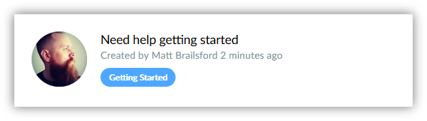
<a href="#" class="bg-white border p-8 flex">
  <div class="flex-0">
    <img class="w-16 h-16 rounded" src="..." alt="Matt Brailsford" />
  </div>
  <div class="flex-1 ml-8">
    <h3 class="text-xl leading-tight">Need help getting started</h3>
    <p class="text-sm text-grey leading-tight mb-3">
      Created by Matt Brailsford 2 minutes ago
    </p>
    <div class="text-xs font-bold text-white leading-normal ↵
      rounded-full bg-blue px-4 py-1">Getting Started</div>
  </div>
</a>
.bg-white { background-color: white; }
.border { border: 1px; }
.p-8 { padding: 2rem; }
.flex { display: flex; }
.flex-0 { flex: 0; }
.w-16 { width: 4rem; }
.h-16 { height: 4rem; }
.rounded { border-radius: .25rem; }
...
Hell no!
Heroku Yahoo GitHub
Medium KickStarter TED
BuzzFeed Tinder Firebase
Rage Stack Overflow Twitch
Algolia Drip Marvel App
Common
Reservations
Isn't this just
Inline styles?
Low specificity
1 to Many Relationship
Responsive & Stateful
Constrained
Won't this be harder to
Maintain?


Won't this be bad for
Performance?
GZIP
Isn't this
Unsemantic?
"CSS CLASSES SHOULD SAY
WHAT THEY ARE NOT
WHAT THEY LOOK LIKE"
.forum-post {...}
.forum-post__media {...}
.forum-post__content {...}
...
.meetup-post { }
.meetup-post__media { }
.meetup-post__content { }
...
.twitter-post { }
.twitter-post__media { }
.twitter-post__content { }
...
.forum-post,
.meetup-post,
.twitter-post {...}

.forum-post__media,
.meetup-post__media,
.twitter-post_media {...}
...
.card {...}
.card__media {...}
.card__content {...}
...
.card--forum {...}
.card--meetup {...}
.card--twitter {...}
...
.margin-none {...}
.padding-none {...}
.container {...}
.col-md-6 {...}
.text-center {...}
.bg-primary {...}
.btn-secondary {...}
.text-white {...}
Presentational classes are
not evil
It's a question of
dependencies
SEMANTIC CSS
CSS
DEPENDS ON
HTML
Reusable HTML
Presentational CSS
HTML
DEPENDS ON
CSS
Reusable CSS
Choose
Based on your needs
The Tailwind CSS
Workflow
Before Tailwind
After Tailwind
Video by @simonswiss
Getting started with
Tailwind CSS
Installation
# Step 1: Init project
npm init -y
# Step 2: Install tailwind
npm install tailwindcss --save-dev
# Step 3: Create tailwind config file
./node_modules/.bin/tailwind init tailwind.js
/* Step 4: Create main css file */
@tailwind preflight;
@tailwind components;
/* Custom Components Here */
@tailwind utilities;
/* Custom Utilities Here */
# Step 5: Process CSS file
./node_modules/.bin/tailwind build main.css ↵
    -c ./tailwind.js -o ./dist/main.css

# Instructions for Webpack, Gulp, Laravel Mix,
# Encore and Brunch available
Configuration
tailwind.js
// .text-black, .bg-red
colors: {
  'transparent': 'transparent',
  'black': '#22292f',
  'grey-darkest': '#3d4852',
  'grey-darker': '#606f7b',
  'grey-dark': '#8795a1',
  'grey': '#b8c2cc',
  'grey-light': '#dae1e7',
  ...
},
// .font-sans
fonts: {
  'sans': [
    'Helvetica Neue',
    ...
  ],
  'serif': [
    'Constantia',
    ...
  ]
},
// .text-sm
textSizes: {
  'xs': '.75rem',  // 12px
  'sm': '.875rem', // 14px
  ...
},

// .font-thin
fontWeights: {
  'hairline': 100,
  'thin': 200,
  ...
},
// .p-1
padding: {
  'px': '1px',
  '0': '0',
  '1': '0.25rem',
  '2': '0.5rem',
  '3': '0.75rem',
  '4': '1rem',
  '5': '1.25rem',
  '6': '1.5rem',
  ...
},
// .m-1
margin: {
  'px': '1px',
  '0': '0',
  '1': '0.25rem',
  '2': '0.5rem',
  '3': '0.75rem',
  '4': '1rem',
  '5': '1.25rem',
  '6': '1.5rem',
  ...
},
// .w-1/2
width: {
  'auto': 'auto',
  'px': '1px',
  '1': '0.25rem',
  '2': '0.5rem',
  ...
  '1/6': '16.66667%',
  '5/6': '83.33333%',
  'full': '100%',
  'screen': '100vw'
},
// .h-1/2
height: {
  'auto': 'auto',
  'px': '1px',
  '1': '0.25rem',
  '2': '0.5rem',
  ...
  '1/6': '16.66667%',
  '5/6': '83.33333%',
  'full': '100%',
  'screen': '100vh'
},
colors: { ... },
screens: { ... },
fonts: { ... },
textSizes: { ... },
fontWeights: { ... },
leading: { ... },
tracking: { ... },
textColors: { ... },
backgroundColors: { ... },
backgroundSize: { ... },
borderWidths: { ... },
borderColors: { ... },
borderRadius: { ... },
width: { ... },
height: { ... },
minWidth: { ... },
minHeight: { ... },
maxWidth: { ... },
maxHeight: { ... },
padding: { ... },
margin: { ... },
negativeMargin: { ... },
shadows: { ... },
zIndex: { ... },
opacity: { ... },
svgFill: { ... },
svgStroke: { ... },
modules: {
  appearance: ['responsive'],
  backgroundAttachment: ['responsive'],
  backgroundColors: ['responsive', 'hover', 'focus', 'group-hover'],
  backgroundPosition: ['responsive'],
  backgroundRepeat: ['responsive'],
  backgroundSize: ['responsive'],
  borderCollapse: [],
  borderColors: ['responsive', 'hover', 'focus'],
  ...
},
Usage
<html>
  <head>
    <title>...</title>
    <link href="dist/main.css" rel="stylesheet">
  </head>
  <body>
    ...
  </body>
</html>
<div class="border bg-white p-6 mb-3">
  <h3 class="font-sans text-xl text-blue">
    Hello World
  </h3>
  <p class="font-serif text-base text-black">
    Lorem ipsum dolar sit amet...
  </p>
</div>
State
<a href="..." class="bg-blue ↵
  hover:bg-blue-dark focus:bg-blue-dark">
  Find out more
</a>
<a href="..." class="group">
  <img src="..." class="border-white ↵
    group-hover:border-blue" />
  <span class="no-underline group-hover:underline">
    Find out more
  </span>
</a>
Responsive
screens: {
  'sm': '576px',
  'md': '768px',
  'lg': '992px',
  'xl': '1200px',
},
<div class="w-full md:w-1/2 lg:w-1/4">
  <h3>Hello World</h3>
</div>
Components
Do you really need
a component?
@for(var lnk in links){
  <a href="@lnk.Url" class="text-blue no-underline ↵
    hover:text-blue-dark">
    @lnk.Name
  </a>
}
@for(var lnk in links){
  @RenderLink(lnk)
}

@helper RenderLink(Link lnk) {
  <a href="@lnk.Url" class="text-blue no-underline ↵
    hover:text-blue-dark">
    @lnk.Name
  </a>
}
@for(var lnk in links){
  @Html.Partial("Link", lnk)
}
<a href="..." class="inline-block rounded p-3 ↵
  bg-blue hover:bg-blue-dark">
  Click me
</a>

<a href="..." class="inline-block rounded p-3 ↵
  bg-green hover:bg-green-dark">
  Click me too
</a>
.btn { @apply inline-block rounded p-3; }
.btn--blue { @apply bg-blue; }
.btn--blue:hover { @apply bg-blue-dark; }
.btn--green { @apply bg-green; }
.btn--green:hover { @apply bg-green-dark; }
.btn { @apply inline-block rounded p-3; }

@screen sm {
    .btn { @apply p-6; }
}

@screen md {
    .btn { @apply p-9; }
}
.btn--blue {
    background-image: linear-gradient(↵
        config('colors.blue'), ↵
        config('colors.blue-dark'));
}
<a href="..." class="btn btn--blue">
  Click me
</a>

<a href="..." class="btn btn--green">
  Click me too
</a>
Tools
Tailwind CSS
In Practice
Benefits
Rapid Workflow
Small filesize*
Easy to adapt
Easy to understand
Challenges
Unfamiliar Syntax
Razor Components
Busy Markup
Find out more about
Tailwind CSS
"The truth is,
I did it for myself
not so that all the world
jumps like me."
Thank You
@mattbrailsford - outfield.digital
APPENDIX
Every F****ing Bootstrap Website Ever
http://adventurega.me/bootstrap/
About HTML semantics and front-end architexture
http://nicolasgallagher.com/about-html-semantics-front-end-architecture/
The Case for Atomic CSS
https://johnpolacek.github.io/the-case-for-atomic-css/
CSS Utility Classes and "Seperation of Concerns"
https://adamwathan.me/css-utility-classes-and-separation-of-concerns/
Tailwind CSS VS Code Plugin
https://marketplace.visualstudio.com/items?itemName=bradlc.vscode-tailwindcss
Build User Interfaces by Composing CSS Utility Classes with Tailwind
https://egghead.io/courses/build-user-interfaces-by-composing-css-utility-classes-with-tailwind
Cycle England
https://www.cycle-england.co.uk/